The Visitation & The Caves of Androzani - revisited
18 November 2013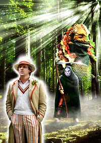 Two re-release covers complete the Davison era, one of which has been a long-time coming, having being included in the first Revisitations boxset three years ago (sorry about that).
First up is a straightforward tidying up of 'The Visitation', re-released earlier this year. I was always quite fond of this cover, with the death-masked android creeping up on the Doctor, so had no plans to redesign it, simply tweak the images. The android and Terileptil were fine, it was the Doctor whose image quality I was keen to upgrade, having since come across a better shot in Gary Gillat's 'Doctor Who from A-Z'. This was better, if still a little grainy (particularly a problem with the fine stripes on the Fifth Doctor's trousers), but I felt his face in this photo was still a tad indistinct. So I did a head-swap with a high-resolution close up I found that fitted the pose just right.
I did hope to find a better quality photo for the background, too, but despite scouring Google for woodland shots nothing seemed to fit the arrangement of the figures, so I simply returned to the original image I had archived and started from scratch, redoing the light and colour balance and recreating the streaming sun rays.
Download the revised VISITATION cover here
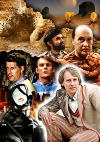 Requiring more work was the cover for 'The Caves of Androzani', which I only finished this past weekend. As with its Revisitation 1 stablemates, 'The Talons of Weng-Chiang' and 'The TV Movie', I had planned to simply tweak the original with better quality images, but at the time could find no cleaner source material. With plenty of other covers to be getting on with, I decided to leave this one to see if better copies of the photos turned up online or in print.
 One key issue was the shot of the Doctor, which was really poor. I still liked my original layout with the focus on Sharaz Jek and Morgus, and the Doctor between them, caught up in their rivalry. But without a higher quality photo of the Doctor I wasn't happy with just reproducing the original design (and what copies of that shot I have seen since make me think the original photograph is rather soft anyway, possibly due to the lighting). A while ago I did attempt the cover again, trying out new layout ideas. The only alternative full-body shot of the Doctor that seemed to fit my cover style was the well-worn one of him crouching as he escapes the gunrunners. As this would have to go in the bottom right-hand corner, I tried to work out an arrangement that maintained the Jek/Morgus bisection, with Stotz balancing the Doctor in the lower left (see right).
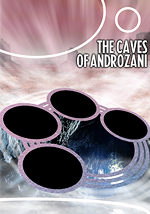 I didn't pursue this in the end, probably because I still couldn't find picture sources of sufficient quality for the size it needed. In trying to devise ways in which I could get away with smaller images, I began to think of including more characters - there being plenty in this story who are villainous enough to go on my bad-guy-focused style of covers. This led me to thoughts of having the Doctor surrounded by a swirl of figures - Jek, Morgus, Stotz, Salateen, perhaps Chellak, possibly an android - representing his passive yet influential presence in the centre of their frantic efforts to outdo each other (and vaguely reminiscent of the regeneration too). The trouble was I couldn't break the set style of having the Doctor foregrounded by having him in the centre of the illustration, and while I put some work into a rings motif (see left) I abandoned it unfinished because I really wasn't sold on the idea. Sometimes you have to actually have a go at sometime to find out if it works or not.
And so the cover went on the back burner again, until my recent efforts to bring the site up to date. This time, after further mulling, a good idea struck: to have characters arranged in layers representing a descent through the caves of Androzani Minor. Still with the Doctor crouching in the bottom right, I could have Jek and his androids bottom left, army characters a level above, gunrunners above them on the surface, and Morgus overseeing all from Major. This allowed for more (and thus smaller!) figures while having a structure that worked visually and thematically. In roughing it out I decided to combine Morgus and Stotz on the surface (as they are in episode 4), and that Jek alone fitted the space at the bottom allowing him to be more prominent. Picture sources were either the DVD photo gallery or scans from DWM, or even combinations of both. As I've discussed before, while scans have detail they're also grainy due to the print screening, while screengrabs have good colour but are soft (especially as I grab them at double size). However, combining both (if the same shot can be found, and with careful alignment) gives a good base for further touching up. I used this technique for both the Doctor and Morgus, Salateen was a scanned head on a screengrabbed body, while Stotz and Chellak were from the disc's photo gallery. Jek was a scan of a black-and-white photo but thankfully easily colourised. Finally I had a bit of fun recreating the mudburst just to fill the areas behind the logo and story number.
Download the revised CAVES OF ANDROZANI cover here


