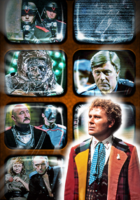
Vengeance on Varos - revisited
17 November 2013 After their initial uncertainty about re-releasing 'Vengeance on Varos', I was pleased that 2|Entertain decided to do so as it was a cover I was more than happy to revisit, and probably would have done anyway once the range was complete. One reason for this was technical: as with several of my early covers, picture sources back then were more limited and I was very unhappy with the quality of the image of the Doctor, and the somewhat clumsy way I'd worked around the Governor's missing arm, which had been cropped off in the photo I used. The second reason to redo the cover was creative, in that I'd long since moved away from the style of having a big looming face in the background (well, except for 'The Awakening' as that story revolves around a big looming face in the background).
Despite this latter thought, my initial plans for the cover were simply to recreate it with higher quality images, and probably adding in the Chief as he's more of a villain than the Governor, whom I'd originally included for being the more recognisable Martin Jarvis. After struggling to find any better photos than those I originally used, however, I renounced my laziness and began to think about redesigning the cover altogether. My thoughts were on the sheer number of characters one could include when the idea of the bank of TV screens struck. This allowed room for more elements without them being cluttered. Picture selection was then pretty straightforward. The Governor still got a spot, and Sil, of course. I planned to pair the Chief and Quillam anyway, but when a decent shot of the latter proved elusive he got slightly shunted into the background. Those were the main characters I wanted to feature, but when the layout made it necessary to fill one more screen I decided to use Arak and Etta rather than birdy Peri as the pairing filled the shape better. As the top-right screen would be largely hidden on the final cover I just filled it with white noise, but overlaid on a shot of the guards' buggy so it wasn't completely 'blank'. Even though the top-left screen didn't need anything, as it would be hidden by the logo, a shot of some guards made a useful filler for the clean illustration.
Finally the photo of the Doctor was scanned from one of the DWM Yearbooks as it was nice and large, with just some writing over his lower half requiring patching over from a lower quality version of the same image. While I liked his grumpy expression in the photo on the original cover, I felt this one fitted the design of the cover well.
Download the final VENGEANCE ON VAROS cover here


