The Reign of Terror & The Tenth Planet
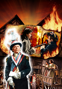
22 November 2013 I think there's a fundamental law of the universe that states it's impossible to produce a cover for 'The Reign of Terror' without using that photo of the Doctor, dolled up in his provincial deputy's uniform with sashes and gloriously feathered hat. To be fair it's a fantastic image, with William Hartnell looking his imperious best, and there aren't many others from the story that look as good. Plus I'd found an excellent high-resolution copy of it so there was really no choice. Even though there are some colour shots of the Doctor confronting Lemaitre and the jailer, I've only seen small copies of these, but they were useful nonetheless in correctly colourising both images of the Doctor and Lemaitre. The former I'm particularly pleased with and is, I think, one of my best colourisations to date. Having a high quality, detailed starting image certainly helps.
The photo of the Doctor dictated its position in the layout, which left the question of what to do with the rest of the space. Being a relatively tall thin area, I suspected I'd need to do one of my two-tier covers, with two landscape sections extending behind the Doctor. One scene that has plenty of photo coverage is Barbara and Susan in the tumbril on their way to the guillotine, so that was an obvious choice for the lower panel. Some of the shots are in colour and I was able to find one at a usable size, although it was cropped so I had to patch in some areas from lower quality colour or colourised black-and-white photos. The other problem with the several shots of this scene is that in all of them either Susan or Barbara is in an awkward position, either looking away from the camera or with head bowed. In the main colour photo I had, Susan was okay but Barbara was turned so you could see only the back of her head, so I replaced her whole upper body with a better shot, which was mono but colourised to match. Some soldiers from separate shots added a more obvious French flavour, and finally I placed an ominous shadow of Madame Guillotine on the far wall to subtly suggest the danger our heroines are in.
For the upper panel I wanted more of a focus on the villains rather than a scene as such. I knew I had a decent photo of Lemaitre, who at least starts out as the apparent enemy, but with him in being in profile (it's the same shot with the jailer that the image of the Doctor is taken from) I needed someone facing him. There are no photos of Keith Anderson as Robespierre, the true villain of the Reign, but I did have one of Barbara and Leon Colbert with the latter handily in the opposite profile. The disc's photo gallery provided another with him standing rather than sitting, which worked better, and replacing the glass of wine he was holding with a flintlock pistol (I have no idea if it's accurate to the place or time period but it looked about right) added some drama to his new confrontation with Lemaitre. Indeed, given both characters are feigning their loyalties during the story, I like the way this face-off makes it unclear who is the true villain, thus not spoiling things for first-time viewers.
With the character images selected and placed against a conciergerie background, it was an artistic whim to have them on a piece of parchment - I think I was vaguely trying to suggest the idea of spies passing secret messages, even though in the story this is all done verbally - and then set it alight a) because that's how spies dispose of incriminating messages, b) as a nod to the destruction caused during the revolution, and c) because I rather like doing fire effects!
Download the final REIGN OF TERROR cover here
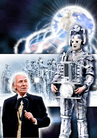
 The cover for 'The Tenth Planet' was the first I tackled in my attempt to get back into doing the covers and was such fun it galvanised me into bringing the site up to date at long last. The layout was straightforward: a focus on the Cybermen was obvious given this is their debut and they're the focus of most photos from the story. Most of the shots of them are in close-up or of groups, but there is one showing a single Cyberman in full length. It wasn't the best quality - all of the photos taken during the Ealing filming seem to be very grainy - but was just about alright.
With no photos of the Doctor from this story I had to look to nearby ones, and this comes from the preceding 'The Smugglers', which I hoped I wouldn't need to use if I ever got round to doing a cover for that story. I did consider including a shot of General Cutler as although not truly a villain he does go off the rails a bit and adds to the danger of the situation, but only one of about three shots of him doesn't show the actor smiling and it just wouldn't fit comfortably without obscuring more of the Cyberman than I was happy with.
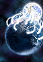
 So with more Cybermen gathering behind the foreground figures, I reckoned the background really needed to speak to the title of the story. For the Earth I wanted a photo in which Antarctica was visible, given the story's main setting (you can just about make it out at the bottom of the cover), while for Mondas I wanted a view of a continent that wouldn't be too obvious what it was when upside down (having always thought the idea of Mondas being an inverted Earth utterly stupid geologically speaking). To liven up the twin orbs I added effects to suggest the energy being drained and Mondas glowing as a result. Much of this is hidden but I feel it adds to the feel of the cover, and besides is more fun to do than just cutting out and montaging figures. You can see the clean background on the right (click for a larger view).
Download the final TENTH PLANET cover here


