Pyramids of Mars
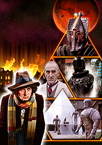
15 November 2015 As I mentioned in my recent blog post, now that I've completed covers for all the released stories, there are a handful of my early efforts that I hoped might get re-released so I would have an excuse to revisit them. I noted that I was never satisfied with my cover for one in particular, namely 'Pyramids of Mars', so I have produced a new design that I'm much happier with.
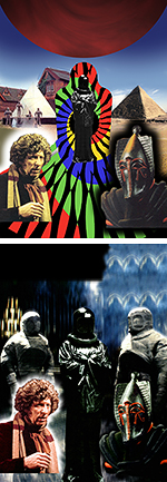
My original cover was a particular victim of the early days, when the computer I had then didn't have a DVD drive so I was unable to take screengrabs from the discs, in particular from the photo gallery. This and the lesser amount of imagery available online back then sometimes seriously restricted my options for covers. Or maybe I just wasn't being imaginative enough, or rushing things too much. In the case of 'Pyramids of Mars', I fixed on the idea of having Sutekh facing the Doctor across the cover (with a black halo around him mirroring the standard white glow around the Doctor) but struggled to devise a compelling background image for these two foreground figures. The obvious choice was the Mummies guarding the pyramid rocket, but if I remember correctly I could only find a small copy of the photo, certainly not high enough quality to use as the main panel.
 Indeed, looking at my original Photoshop file reveals the remains of some early ideas. Top-right is my initial rough layout. I quite like the symmetry of the two pyramids either side of the helmeted Scarman in the time tunnel, but the top of the buildings on the left was missing and I suspect I wasn't confident of patching them in convincingly, or of creating an accurate representation of the spiralling effects in the time tunnel. Below is idea two, with Sutekh's emissary between two Mummies. As well as the images being rather dark, and my not being happy with blurring the background to hide its patchiness, I think I decided this attempt was just too dull for one of my favourite stories -- slightly ironic as what I went for in the end was little better: two Mummies hugging Clements to death, requiring a rather feeble effort to add some excitement by zoom-blurring the background! Hence my disatisfaction with the final cover, probably settled on so I could make it available in time for the DVD's release.
So in rethinking the design from scratch, and with a wider selection of photo sources, one desire was to include more figures -- in particular Marcus Scarman -- in a way that didn't require a large background 'scene'. I quickly hit on the idea of a pyramid shape representing the hierarchy of villainy in the story, with Sutekh at the apex, Scarman below him, the Mummies below him, possibly Namin and the helmeted Scarman -- which strictly speaking is a duplication but is a great piece of design. I drew the framework of triangles in Illustrator and imported it into Photoshop as a set of paths to enable nice sharp selections for the layer masks. Initially it was all triangles but I soon realised some elements, such as the Mummies at the bottom, would need to take up more than one panel and having lines cut across them looked confusing, so I redid the framework with some triangles combined into other shapes.
The character elements then slotted in quite straightforwardly. Sutekh went at the top, of course, and I decided on both forms of Scarman below him, partly so I could include the iconic sarcophagus in the background too. In retrospect I could have put Marcus Scarman in the right-hand panel with the sarcphagus and had Namin on the left, but I do like that spooky helmeted figure. I think I vaguely thought Namin could go in the bottom-left section before I realised it would have to be covered up by the Doctor. In fact, he was the figure I had most deliberation over. There were two or three colour photos of the Doctor from the story that I considered using, and even a publicity shot from the season (which I usually avoid if the actor is looking into the camera, as he was in this instance but it was a crisp high-resolution image). But then I spotted that photo of the Doctor looking particularly stony-faced, which just felt perfect despite being black and white. So for the first time, I think, I went with a colourised Doctor on a non-60s story cover.
Finally, for the background a shot of Mars at the top seemed appropriate, while to fill the space behind where the title would go I used a shot of the priory screengrabbed from episode one and set it ablaze, which matched the yellow and orange elements I'd used elsewhere.
As I say, I'm much happier with this cover, which feels much more engaging than the original. However, so as not to completely whitewash my past, the first effort is still on the site if you really prefer it (and can find it).
Download the final PYRAMIDS OF MARS cover here


